
Okay, I have to talk about this color!
Because chartreuse for a wedding? It is absolutely beautifully unique.
It’s unexpected. It’s bright without being neon, green without blending into the background, and somehow manages to feel both playful and incredibly pretty.
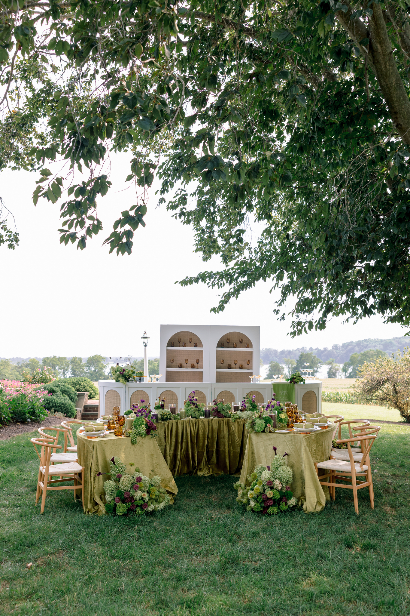
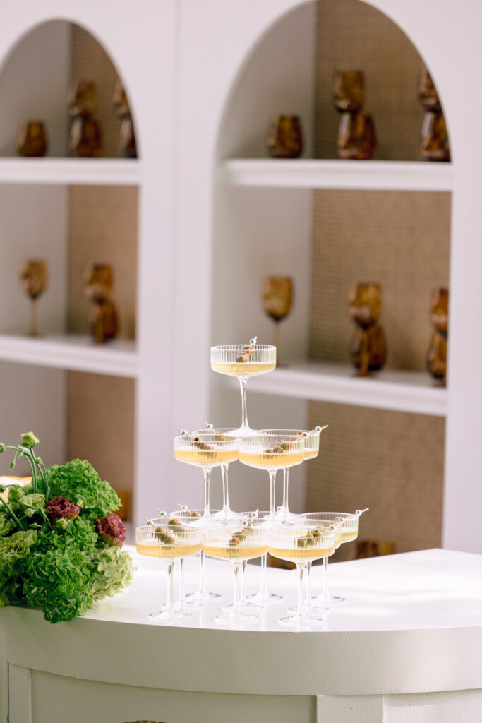
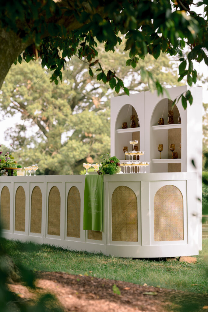
For this editorial at Brittland Estates, chartreuse showed up everywhere, from the invitations and linens to the florals, bar, cake, and even the backdrop for the bridal portraits.
And somehow, it never felt like too much.
It all just worked.
The kind of wedding color palette that makes you stop scrolling
I love a wedding that has a clear point of view.
This one wasn’t trying to be beige. It wasn’t trying to look exactly like the wedding that came before it. And it definitely wasn’t afraid of color.
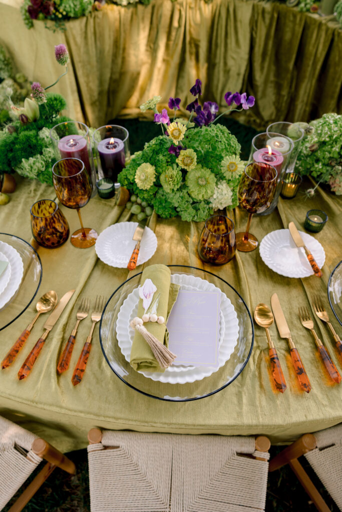
The chartreuse was layered with deep purple, burgundy, soft pink, creamy whites, warm amber glass, and tons of greenery. Nothing was perfectly matched, but everything felt connected.
That balance is what made the whole thing work.
It felt colorful. It felt elevated. But it still felt like a party.
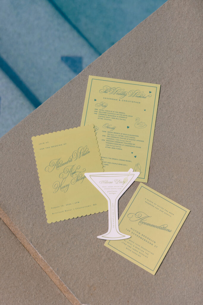
The invitation suite set the tone
The wedding design started before anyone even arrived.
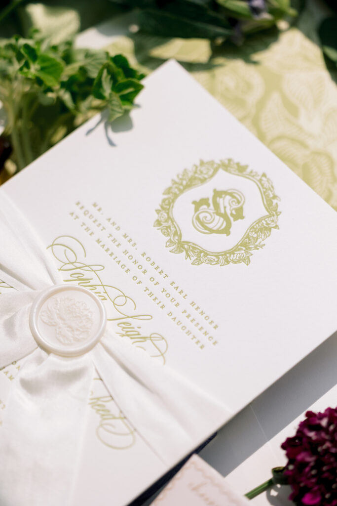
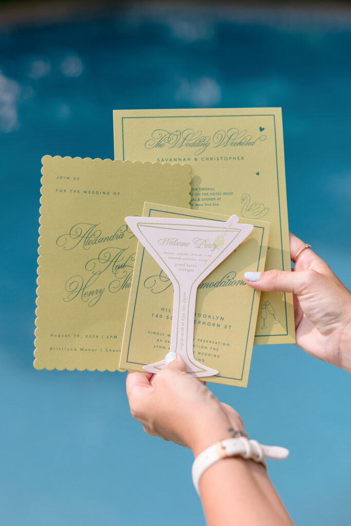
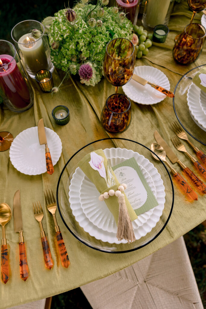
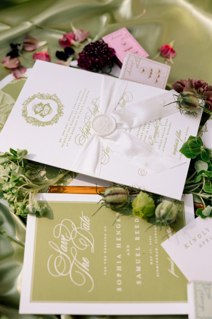
The invitation suite brought in the chartreuse through the paper, calligraphy, and details, while the soft green satin underneath created this really beautiful backdrop.
Then came the loose petals and little pops of purple and burgundy.
I love when a wedding invitation gives you a little preview of what’s coming instead of just existing on its own.
It makes the whole wedding feel like one story.
The flowers were anything but boring
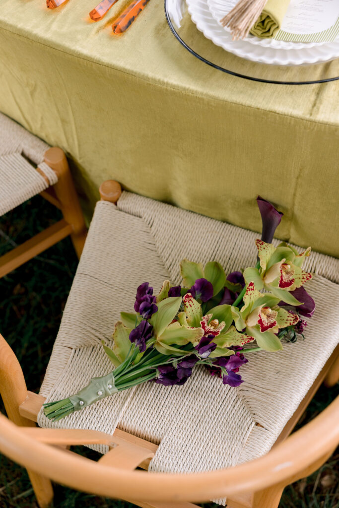
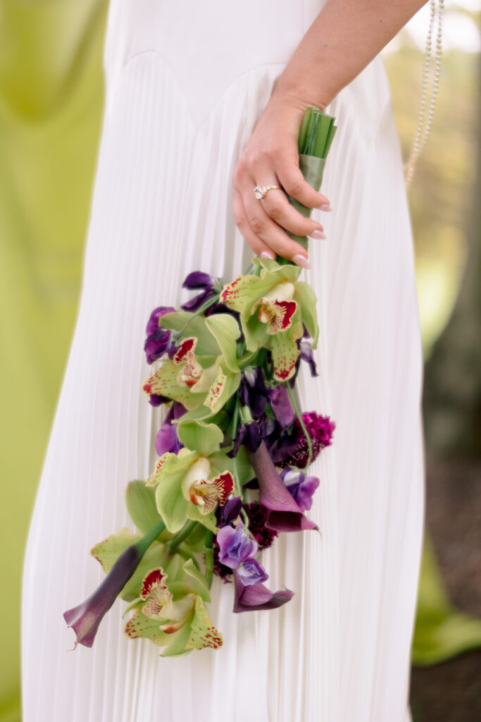
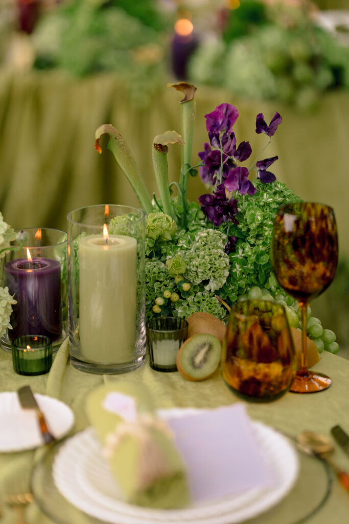
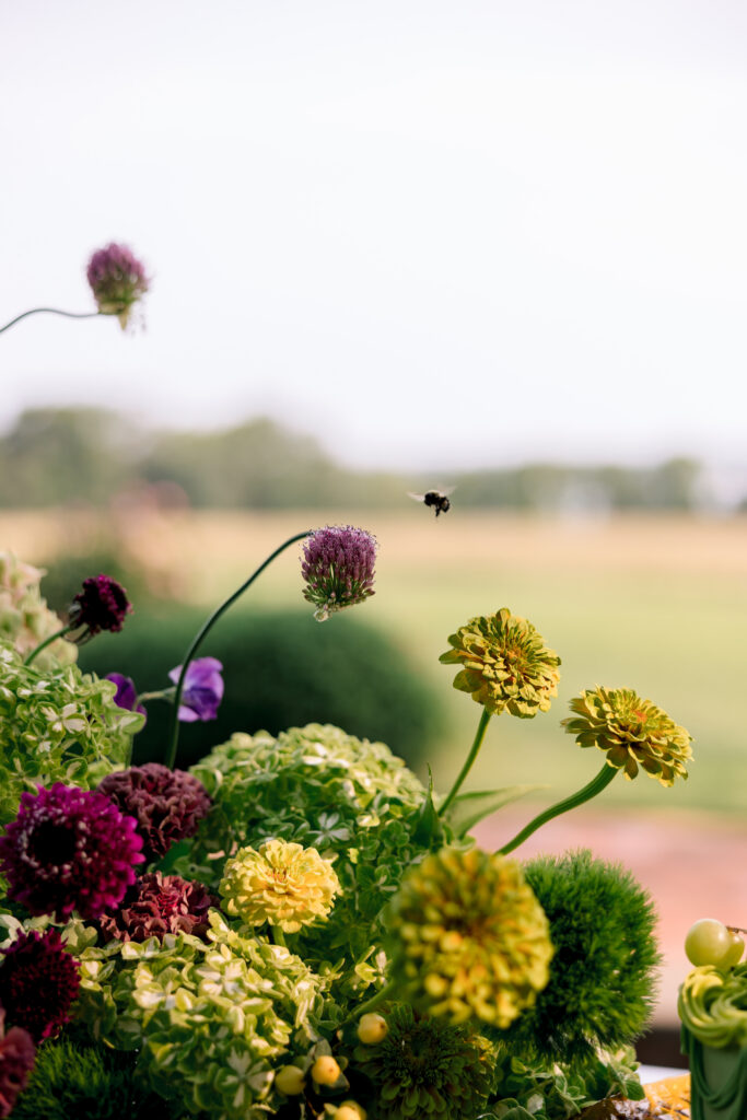
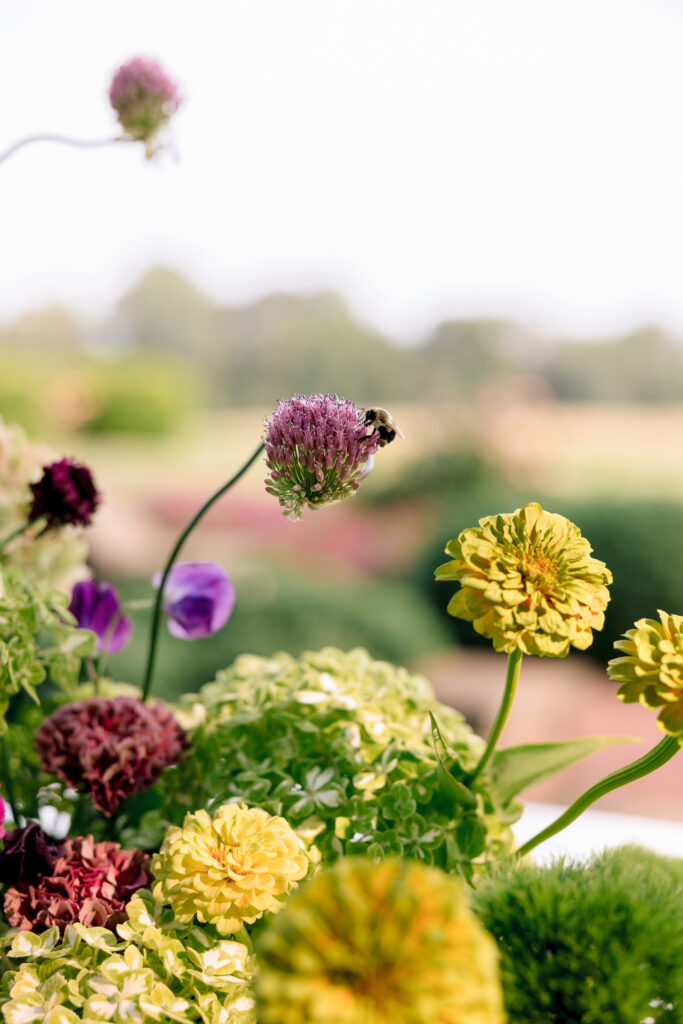
The floral design was full, textural, and a little bit wild.
There were soft greens, chartreuse tones, creamy blooms, deeper purple flowers, and plenty of movement. Instead of everything being super structured, the arrangements had this beautiful looseness to them.
And I loved that the flowers didn’t just stay on the tables.
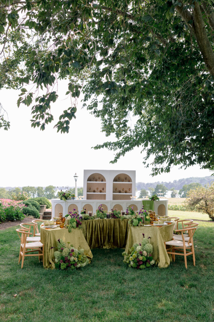
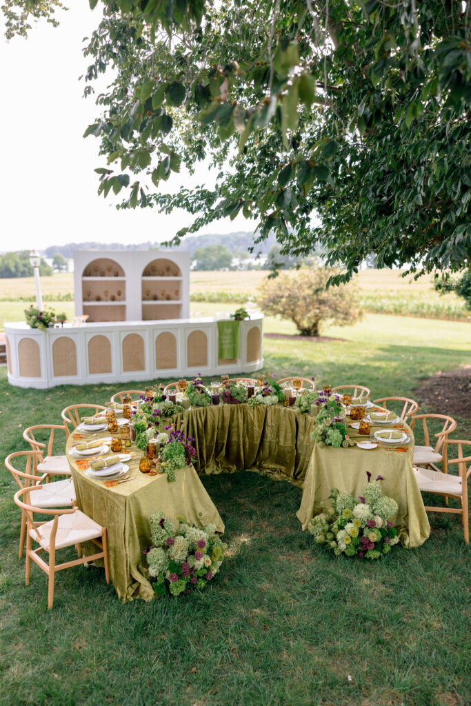
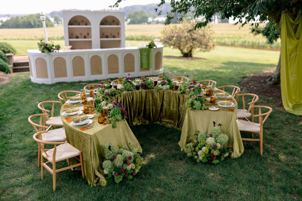
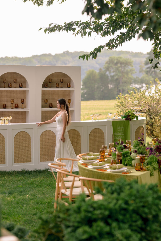
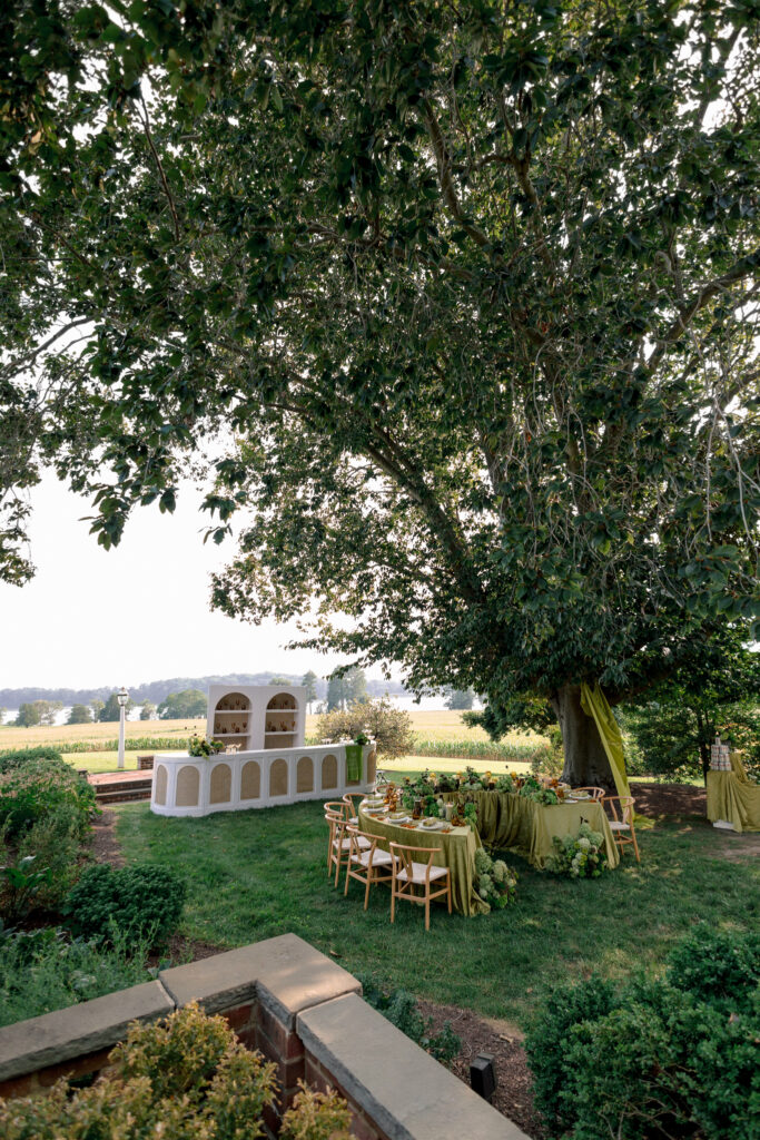
They spilled onto the ground, became part of the surrounding space, and made the whole dinner feel like it had grown right out of the landscape.
Imagine actually eating dinner here
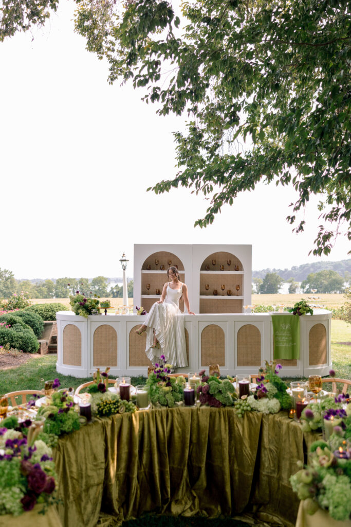
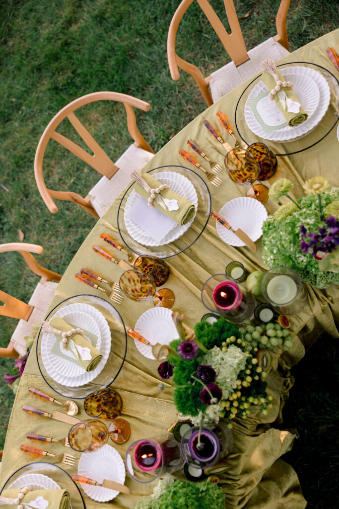
The tablescape was probably one of my favorite parts of the entire editorial.
The chartreuse linens against the grass and trees. The amber glassware. The flowers everywhere. The warm wood chairs.
It felt elevated, but still relaxed.
Like the kind of dinner where you sit down with your favorite people and somehow end up talking for three hours!
That’s my kind of wedding.
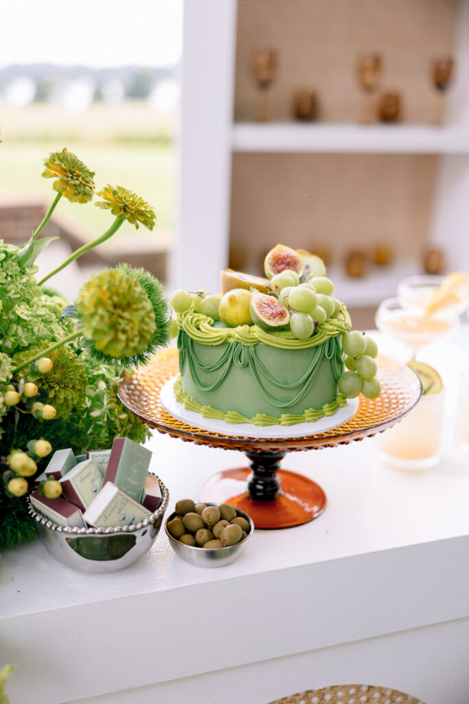
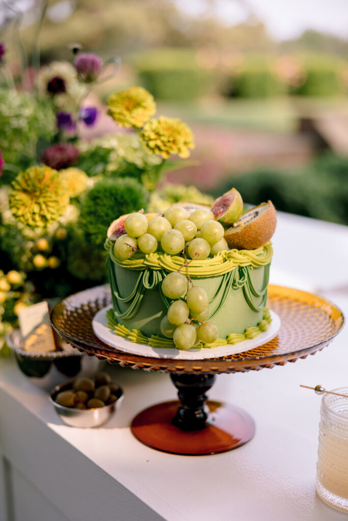
And yes, the cake is part of the design
I love when couples don’t treat the cake like a random thing that gets wheeled out at the end of the night.
This one completely belonged to the rest of the design.
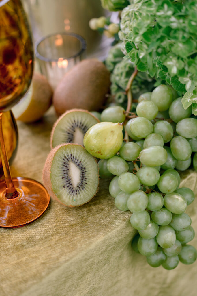
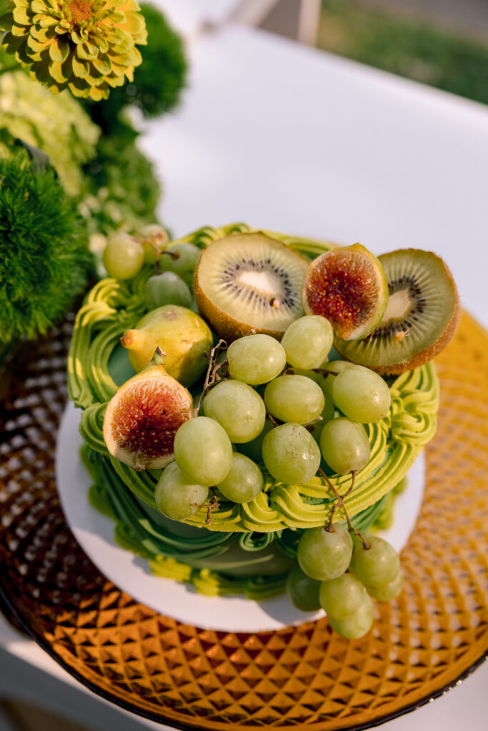
Soft chartreuse buttercream. Hand-piped details. Fresh grapes and kiwi. A dark glass cake stand.
It felt fresh and a little unexpected without trying to be quirky just for the sake of it!
Also: fruit on a wedding cake will forever have my vote.
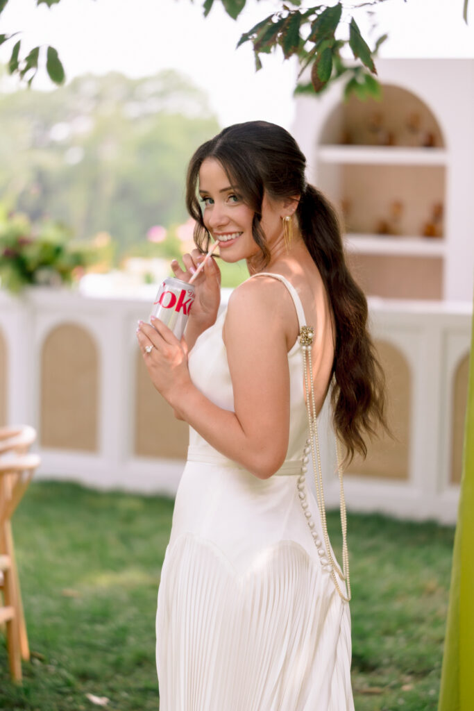
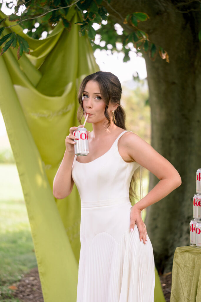
The bridal portraits really pulled it together
This is where the color palette got especially fun.
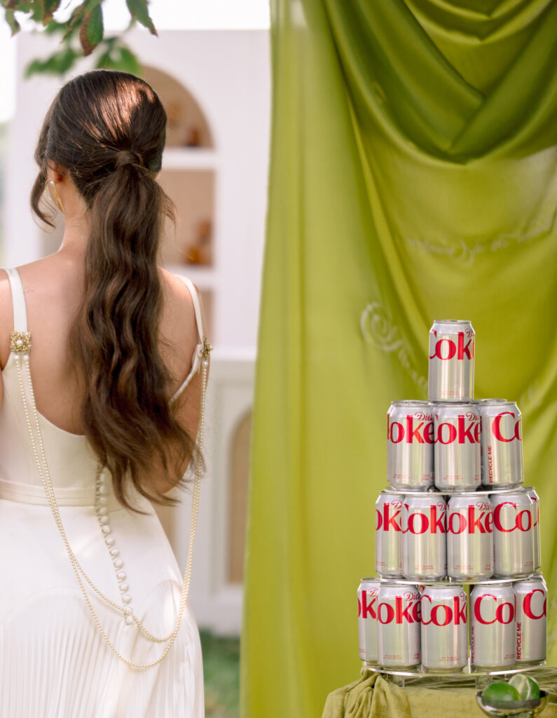
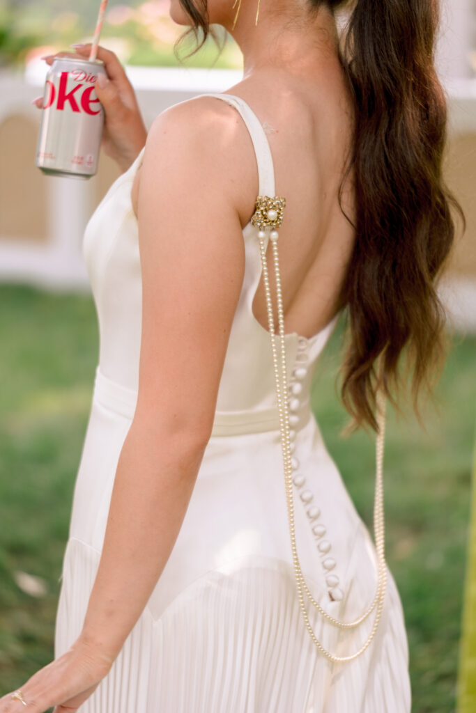
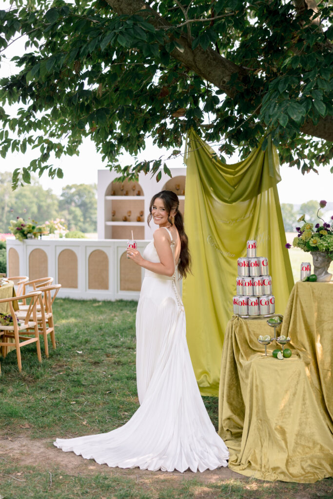
The simplicity of the white gown against all that green made the dress stand out beautifully, and then the chartreuse draping added this really cool editorial element without taking over the photograph.
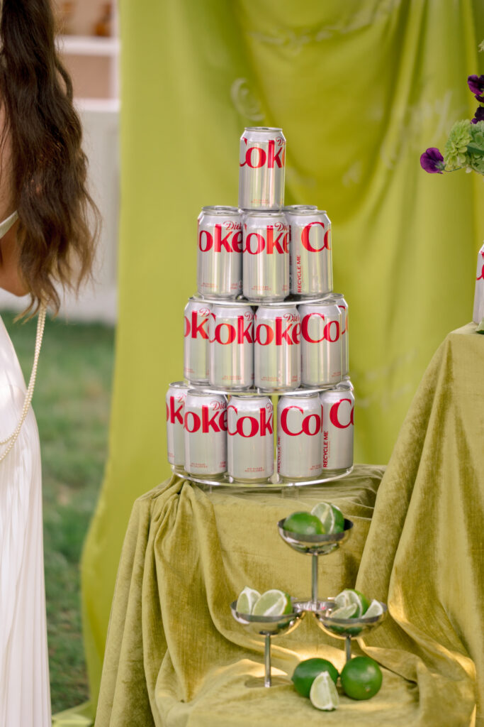
And then there was the Coca-Cola display.
Was it necessary? Absolutely not.
Was it thoroughly loved? Also, absolutely yes.
That was probably my favorite thing about the whole editorial: it was beautiful, but it wasn’t taking itself too seriously.
Your wedding is allowed to be fun
I think that’s what I took away from this shoot more than anything.
Your wedding can be beautiful and quirky.
It can be elegant and playful.
You can care about the flowers and the paper and the lighting and still have a giant dance floor and a late-night snack and a color palette that isn’t neutral.
You don’t have to make every decision based on what is “timeless.”
You just want to make choices that feel like you.
Because ten years from now, I don’t think you’ll care that your wedding looked exactly like everyone else’s.
You’ll remember that it felt like yours.
Brittland Estates
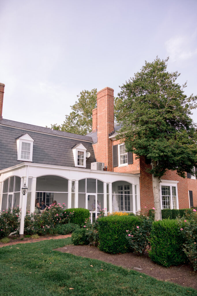
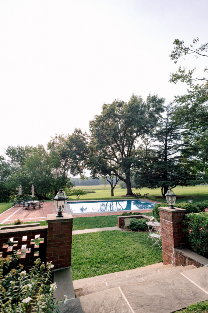
Brittland Estates was such a beautiful setting for this kind of celebration.
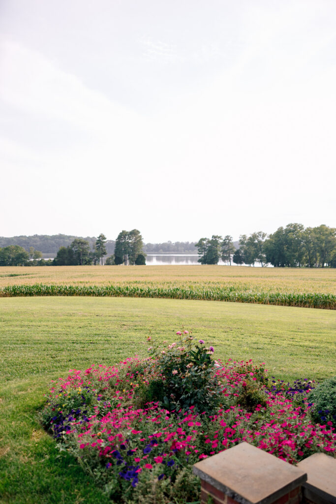
The water, the mature trees, the open fields, and the garden-like setting gave the color somewhere to go without competing with it.
The whole editorial felt like a summer dinner party that just happened to be a wedding.
And honestly?
I think that’s the dream.















The Creative Team
Planning + Design
SRS Events — @srs_events
Venue
Brittland Estates — @brittlandestates
Photography
Rachel Yearick Photography — @rachelyearickphoto
Content Creation
Honey Do Socials — @honeydosocials
Floral Design
Love Blooms DC — @lovebloomsdc
Rentals
Pretty Little Wedding Co. — @prettylittleweddingco
DC Event Rentals — @dcreventrentals
Linens
Rosalia Road — @rosalia_road
Cake Design
Liberty & Jisoo — @libertyandjisoo
Signature Drinks
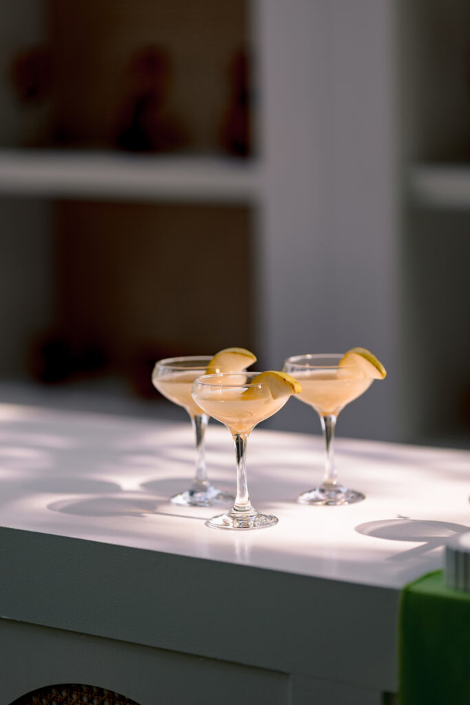
Sip DC Mobile Bar — @sipdcmobilebar
Invitation Suite
Ledgewood Fine Stationery — @ledgewoodfinestationery
Paper Details
Minted Weddings — @mintedweddings
Fabric Banners
Lollipop Media Designs — @lollipopmediadesigns
Beauty
Amie Decker Beauty — @amiedeckerbeauty
Bridesmaid Dress
Revelry — @shoprevelry
Gowns
Zoya’s Atelier — @zoyasatelier
Gown Designers
Amsale — @amsaleweddings
LIHI HOD — @lihihod
Suzanne Neville — @suzanneneville
Models
Eden & Luke — @edenandluke
Victoria Catherine — @itsvictoriacatherine
Morgan Dunn — @morgdunn